Boo and Bimba
Pre-school subscription box start-up Boo and Bimba approached us to create an engaging visual identity that captures the concept of ‘magical curiosity’.
—
Logo and brand development


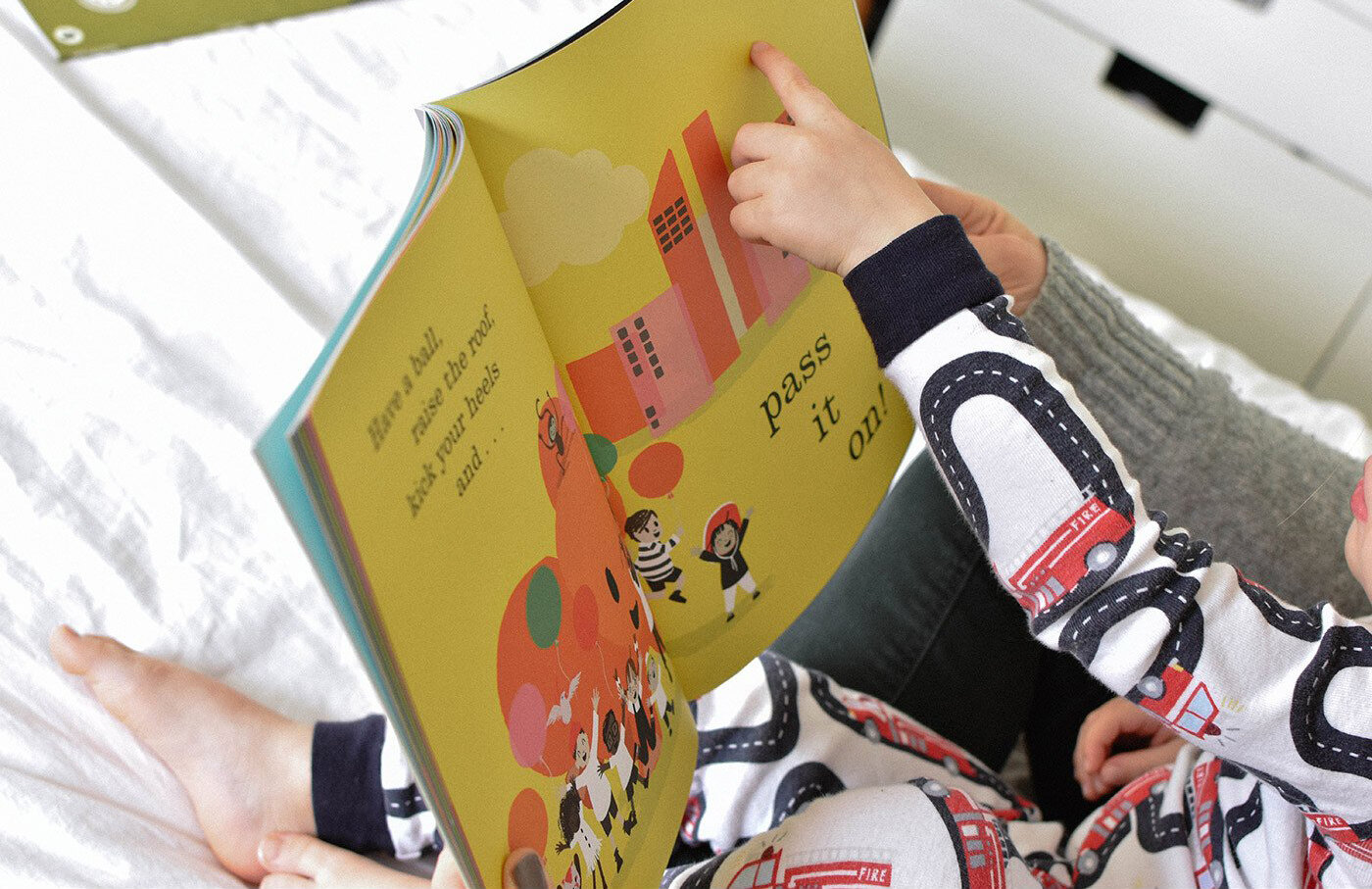
Boo and Bimba promotes an early love of language through storytelling, utilising both printed picture books and interactive technology. To echo this, we designed a logo that brings together whimsical serifs and clean capitals, with nostalgic colours that pop next to each other to give a cheerful, contemporary twist.
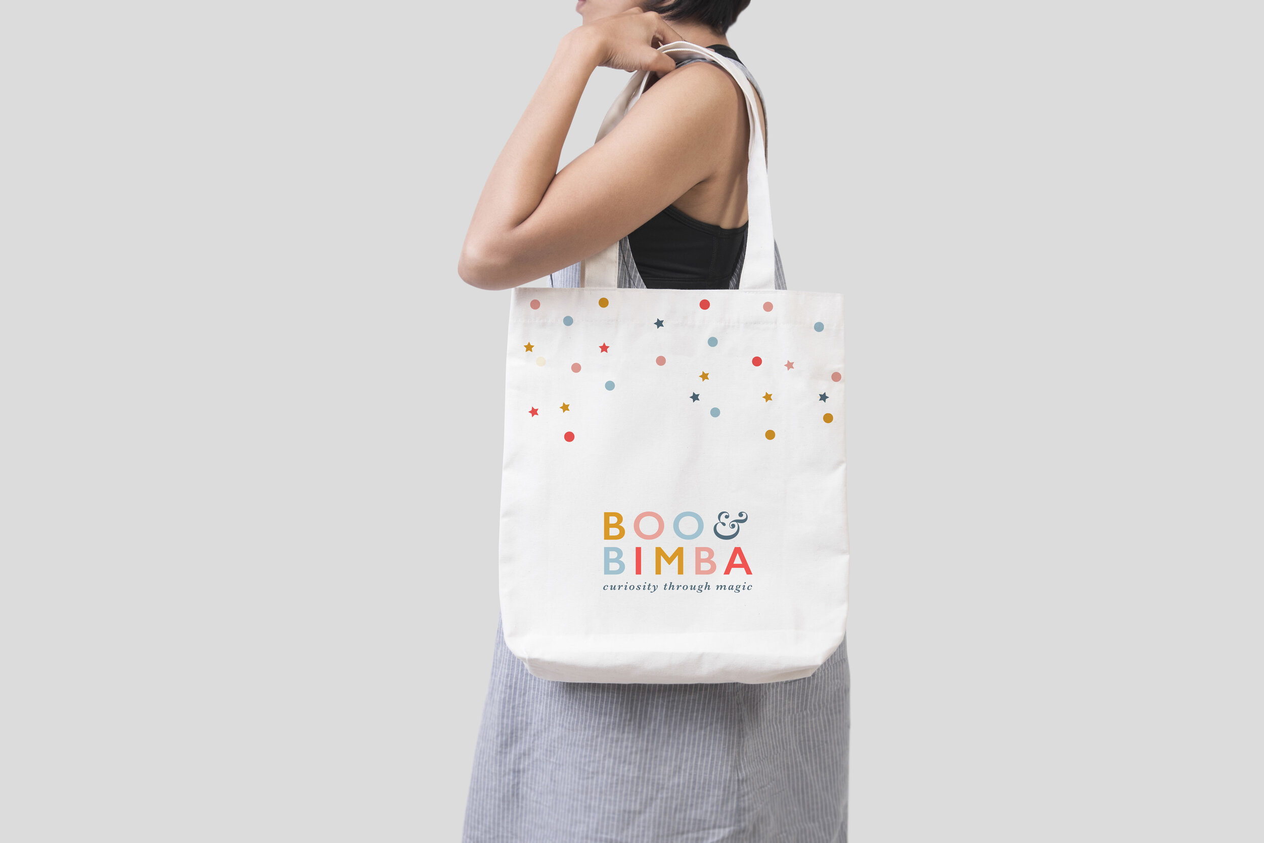
Simple illustrative elements and confetti-like patterns add layers of magic and wonder, reminiscent of magician’s stars and vintage toy blocks. The Bimba bird brings personality too; flitting her way across the packaging, through to the website and beyond. A recognisable narrative for small children, the bird character is a nod to little ones exploring the world through language.

“Just fantastic! Highly creative, engaged in the project – producing work well above our expectations and with superb communication and a very friendly nature to boot. Would recommend in an instant!”
— Arjun Chatterji, Co founder, Boo and Bimba