Reading Cycle Festival
Part of Cycling UK’s Bike Week, the Reading Cycle Festival is a day long event for all the family; encouraging more people to get outdoors and on to their bicycles.
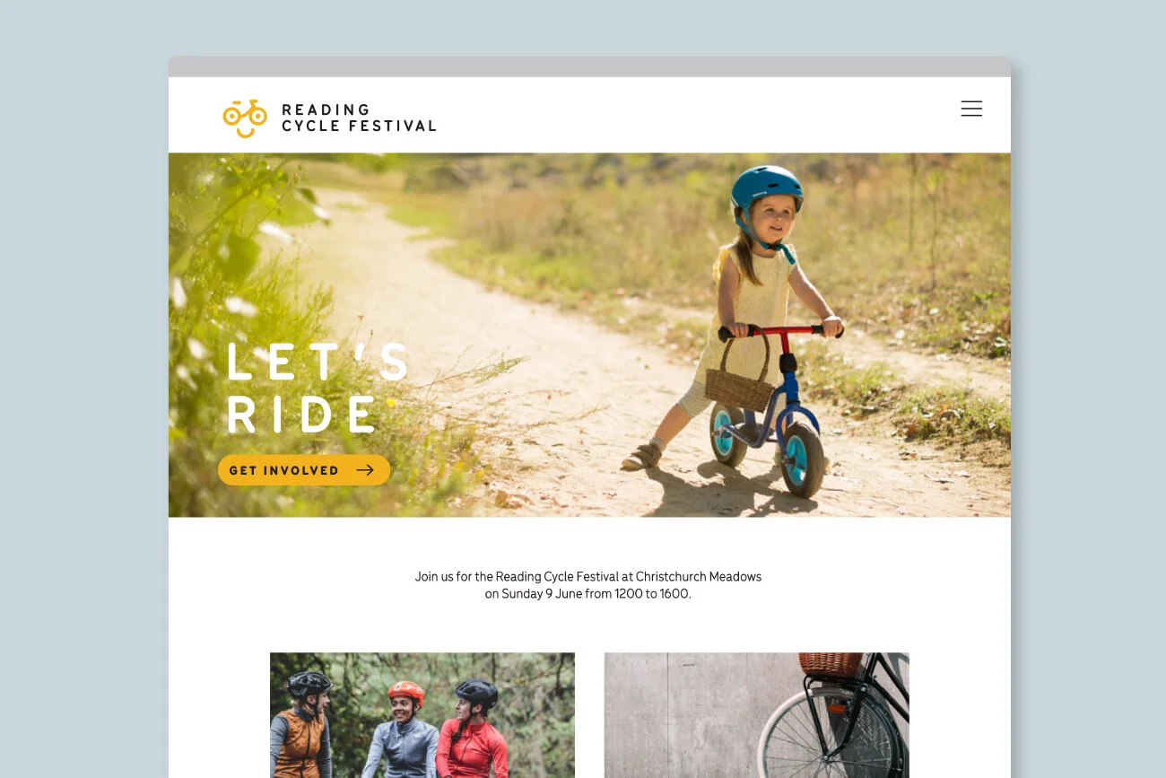
The cycle festival needed an identity to reflect the open, friendly nature of the event. We produced a charming, contemporary logo that would appeal to families looking for a fun day out.
—
Brand identity
Part of the brief was to include a human element to the logo as well as a bicycle, whilst keeping it simple and modern. It’s the kind of challenge that we love – making the design as uncluttered and bold as possible often produces the most effective results.


“Studio Bud came up with a light-hearted logo encapsulating the spirit of what we are trying to achieve with our cycle festival. We are very pleased.”
— Andy, Reading Cycle Festival

From t-shirts to pin badges, the logo is bold enough to work at a wide range of sizes. Utilising a small set of optimistic and vibrant brand colours strengthens our straight forward approach and helps to give the event brand a solid framework for the years to come.


